[While I won’t be doing one of these every day, I thought it might be interesting to note some of the difficulties experienced and what I have leaned so far from working on a project during GameBoy Game Jam this year.]
It’s interesting. While I don’t always associate myself as a creative type, I’m drawn to projects that have tough requirements and strict rules. Instead of having the freedom to make anything you want (much like One Game A Month), I like hard constraints that cause me to think about and around the problem. It’s why I prefer to write in the haiku and terza rima formats for poetry — they have challenging syllable and layout rules.
That’s what I liked about my additional rules of using black and white only for Pale last weekend. It was a design choice that caused me to spend time playing with and pondering the form. I had to really think about how to use only two colors and still present movement without one form blurring into another.
It’s also what brought me into contact with this year’s GameBoy Game Jam and why I decided to do another game jam back-to-back with the last one. After reading its rules, I just knew I had to participate.
- The only official rule is the game must be GameBoy Themed
- Keep in the original GameBoy screen resolution of 160px x 144px.
- Use only 4 colors in your game.
The first is passable. It is remarkably easy to link any game to one released on the GameBoy. That’s not much of a rule.
As for the second, well, that’s not much of a stretch for me. I often work in the 16×16 space for map tiles and images, so I can create something fairly easily.
No, it was the last one that I really began to love — and found equally frustrating.
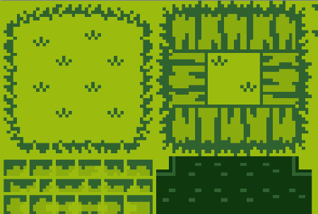
See, I thought, before beginning to actually draw things last night, that I could get started quickly. I could translate some of the tiles I made into the four color set easily, I thought. That proved to be quite wrong.
The problem is the background.
Say, for example, you create a 16×16 square and fill it with the lightest color available on the GameBoy (#9BBC0F).

Well, now you have a problem. One that is, perhaps, not as obvious but one that will manifest quickly. With a background of one color, you have limited yourself to the three other colors.
Create an inner square of the next darkest color (#8BAC0F) and the contrast is very hard to determine. Sure, if you concentrate a little, you can see the difference, but the one shade of green doesn’t “pop” against the other.
What you need is another color to balance them. And so you use the next darkest color (306230).

Now, you have used three of the total of four colors.
But what if you wanted a shadowed border color and one for the shadow on the inside? You cannot use any of three used so far, you need to move to the next color (0F380F), swapping its placement for the previous color.

And so, it becomes a balancing act. To create edges with a visual contrast, two of the four colors can be paired together. However, if the next pixel is the same color, then another line will need to be drawn too. It becomes a matter of outlining one mass of color for another instance of the same. Like the problem with using black and white, one color must be delineated from the other.
In this case, it is a matter of using the other two colors as edges, shadows, or the visual break from one to another tile or pattern.
It’s a lesson I think I have a good handle on at the moment. So much so, in fact, that I thought I would share the tiles I have created (and are currently using) for others to use as well.
So, I have created the following collection and posted them to Open Game Art. And I also plan to post the next, dungeon, set as well once I get them drawn tonight.