Learning Bootstrap
- Part 1: Installing and Using
- Part 2: Containers and Rows
- Part 3: Grids
- Part 4: Working with jQuery Plugins
Using Bootstrap
Bootstrap is a free and open-source front-end framework for designing HTML- and CSS-based website and web applications.
Grids

While containers and rows define the horizontal layout of sections within Bootstrap, the grid system defines the columns, their width, and related spacing.
Columns within the Grid System come in five different sizes:
- .col-
- Width: <576px
- .col-sm-
- Width: ≥576px
- .col-md-
- Width: ≥768px
- .col-lg-
- Width: ≥992px
- .col-lx-
- Width: ≥1200px
By default, the .col- prefixed classes will auto-generate equal spacing between them. Using two will split it in half. Using three, in thirds.
Breakpoints
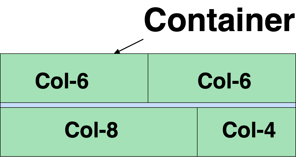
In Bootstrap, the total number of horizontal slots is 12. Using breakpoints, the point at which a column should break, allows for different sizes of columns in the same row.
As long as the total breakpoint count does not exceed 12, columns of size 2, 4, 6, and 8 can be mixed together. (Columns with a breakpoint of 12 fill up the whole row.)
Responsive Sizing
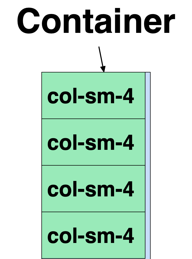
The different breakpoints are useful when considering how a row of content will appear on smaller or larger screens. Because the breakpoints dictate where the columns will break, those with smaller breakpoints will stack vertically under those which precede it in the same row.
Mixing Sizes
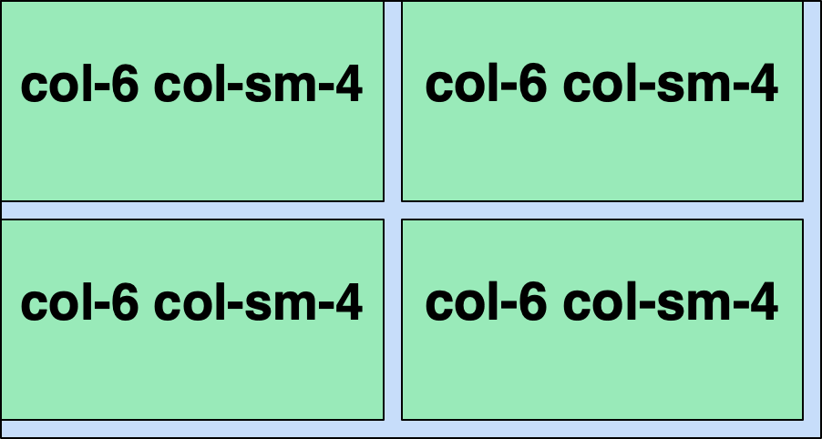
Different sizes and breakpoints can be mixed so that they appear as part of a longer, in-line row on larger displays and stack underneath each other on smaller displays. Because breakpoints act on the size of the display, they can help in defining a dynamic layout where content flows nicely regardless of display size.
 Digital Ephemera