Learning Bootstrap
- Part 1: Installing and Using
- Part 2: Containers and Rows
- Part 3: Grids
- Part 4: Working with jQuery Plugins
Using Bootstrap
Bootstrap is a free and open-source front-end framework for designing HTML- and CSS-based applications.
Cards
In Bootstrap 4, Cards are flexible content containers.
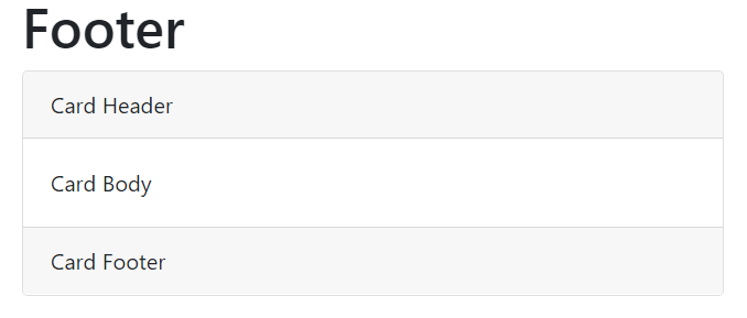
Like other Bootstrap components, the initial class applied to a Card is its name, card. Inside elements with this class, additional elements can be assigned to one of three main areas, header, body, or footer, using the prefix card- and then the name of the area.
Header


Body


Footer

Color Cards
As a Bootstrap component, Cards can use the built-in color classes for background and text colors. (Borders can also be applied in the same manner.)


Card Grids
By default, cards fill all available horizontal space. However, as they are part of Bootstrap, they can also use the grid system to place them next to each other.


Card Decks
Finally, and beyond the use of the Bootstrap grid system, cards can also be placed in decks. A Card Deck organizes all cards within it as having equal height and width divided up from the available space.
A card deck starts with an element with the class card-deck that contains other elements with the class card.


 Digital Ephemera