Learning Bootstrap
- Part 1: Installing and Using
- Part 2: Containers and Rows
- Part 3: Grids
- Part 4: Working with jQuery Plugins
Using Bootstrap
Bootstrap is a free and open-source front-end framework for designing HTML- and CSS-based applications.
Buttons
In Bootstrap, a button is both the HTML element and those elements with a type attribute set to “button”.
As a component, Buttons also have access to the built-in color classes. However, and similar to Alert, class pairings start with btn and then use the prefix btn- before the built-in color classes.


Sizes
In addition to the built-in color classes, buttons can also be three different sizes: large (btn-lg), small (btn-sm), and block (btn-block).
Buttons that have the btn-block class fill up all available space.


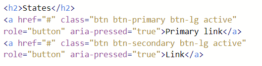
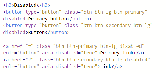
States
Both button HTML elements and those elements using the btn class to replicate the presentation of buttons have two states: active and disabled.
Active
HTML Buttons, by default, are “active.” To create the same effect on elements using the btn class, the class active can be applied. (It is also highly recommend to use the attribute aria-pressed with a value of “true” to help assistive technologies recognize this state.)

Disabled
HTML buttons can be disabled through applying the attribute disabled. For those elements using the btn class, the class disabled can be applied. (Like with the active state, it is also highly recommended to use the attribute aria-disabled with a value of “true” to help assistive technologies recognize this state.)

 Digital Ephemera