Learning Bootstrap
- Part 1: Installing and Using
- Part 2: Containers and Rows
- Part 3: Grids
- Part 4: Working with jQuery Plugins
Using Bootstrap
Bootstrap is a free and open-source front-end framework for designing HTML- and CSS-based applications.
Borders
To help with styling elements, Bootstrap supplies multiple versions of borders. These are classes that help with either adding or removing borders.
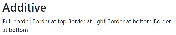
Additive
Border classes that are additive add more borders to an element. When used, they supply either full borders or a border on a particular side.

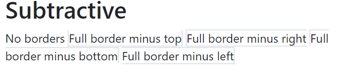
Subtractive
Border classes that subtractive subtract a certain side after the border class has been applied. They act to remove either the full borders or a particular side.

Colors
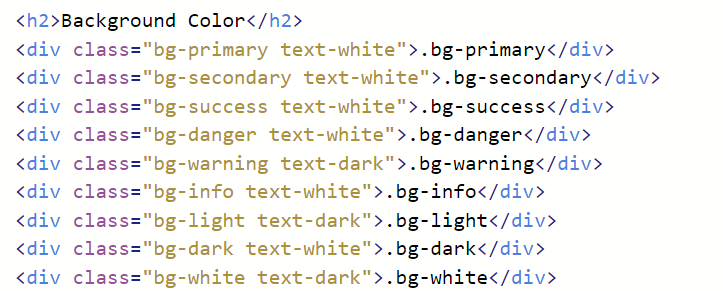
Similar to borders, colors in Bootstrap act on elements to change their presentation. To help with designing and planning for assistive technologies, Bootstrap comes with over a dozen built-in color classes.
- primary
- secondary
- success
- danger
- warning
- info
- light
- dark
- body
- muted
- white
- black-50
- white-50
Bootstrap also supplies both text and background color classes matching its built-in styles.
Text Colors
Text color classes start with a text- prefix and are followed by the built-in color class name.


Background Colors
Background color classes follow the same general pattern as text color classes. They start with a bg-prefix and use the same built-in color classes.
To help readability, text color classes should also be used with background color classes.

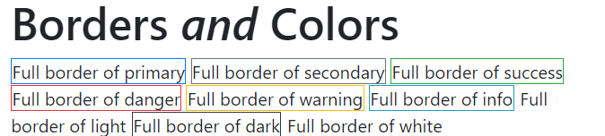
Border andColors
The built-in color classes can also be used with borders. Following the same rules of using border to add full-bordering or one or more of the subtractive border classes, colors can be applied to borders.

 Digital Ephemera