Learning Bootstrap
- Part 1: Installing and Using
- Part 2: Containers and Rows
- Part 3: Grids
- Part 4: Working with jQuery Plugins
Using Bootstrap
Bootstrap is a free and open-source front-end framework for designing HTML- and CSS-based applications.
Alerts
An alert is one of many components Bootstrap supplies developers that act as a quick way to display information, warnings, or other details to a user. As a component, they have a role aspect that marks them as more than simply presentation or layout.

A quick, visual way to think of alerts in Bootstrap is a combination of borders, text-, and background-color classes. Like borders, the first class applied is alert and then there is a class using of the build-in color classes with the prefix alert- followed by its name.

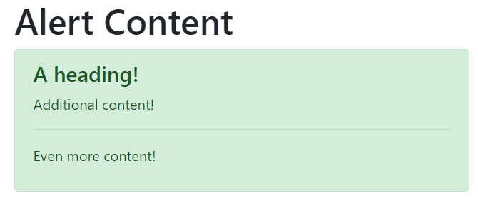
Alert Content
While the use of the class alert and then a prefixed color class changes elements into the Alert component, they can also use additional classes to build complex content areas.
Heading
The alert-heading class can be used to create a heading within an alert.
Content
Any additional elements included within an element with the class alert show up within the Alert itself and can be used to include more detail.

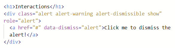
Interacting with Alerts
In Bootstrap, components are content areas that may have some form of interactivity. For Alerts, they can optionally be dismissed.
To make an Alert have an interactive aspect, an additional class alert-dismissible must be added to the element. Elements with the
alert-dismissible class should also use the class show to signal that it has not already been dismissed (hidden).
In order to dismiss (hide) an Alert, it must contain an element with the attribute data-dismiss with its value set to alert. It is recommended to use a link, button, or other interactive element for this.

 Digital Ephemera